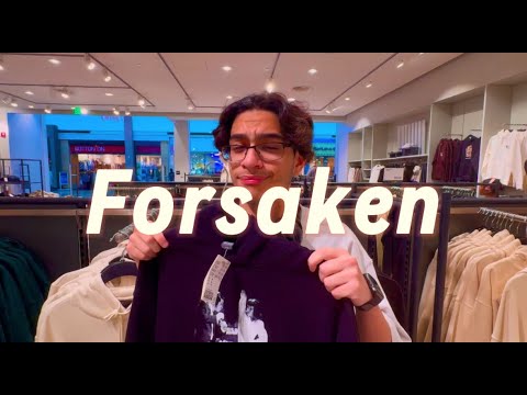
Greetings Bloggers! Today we at CineMarcus Productions are excited to share with you the analysis of our upcoming title sequence in our film opener Forsaken! I am incredibly proud to share with you our latest updates on this and oh my goodness. You guys are in for a treat. I hope you enjoy the process to which we will craft this magnificent piece of work!

My partners Alexander and Justin and I have aimed for the title sequence in our introduction to highlight the film's name and the contributors to the productions (aka mine) while setting the overall tone and mood for the rest of the film! Because of this, we have started investigating and actually have concluded that the choice of font for our title sequence would significantly improve its impact! We then searched for a font that would basically kind of embody the style and spirit of the film opener. For this reason we have found five fonts that we felt captured that essence and in the end narrowed it down to a single choice!
Forever Freedom (WINNER)

We searched for a font that sets a bold, modern, and memorable tone, which is why I personally chose the Forever Freedom font! Its clean lines and classic design perfectly giving Forsaken a somewhat professional look right from the beginning. It just feels right if you know what I mean? Anyways, whether viewed on any sort of screen, this font in my opinion stands out and makes sure my title is noticeable. It’s not just a font, but it’s the first impression of the entire film, and it’s exactly what I needed!
Monument Extended

This font called Monument Extended with its kind of elongated letters show how strong it is to read, setting the right tone for a story full of emotion like Forsaken! This clean modern style feels very fresh in my opinion, giving Forsaken a professional feel to it as well. But even though this font is very strong, my partners and I really didn't feel like this would be the perfect one to use in our opener.
WigWag

Cheddar Gothic

This font known as Cheddar Gothic is REALLY eye-catching. This design with its rustic and expressive style really captures the essence of a font being used in a drama film, making it one of the more perfect choices me and my partners thought we could use. However, even with its diverse range of additional styles, the font isn't as perfect as our winner that was previously mentioned.
Balneario

Balneario is yet another great option but it wasn't better than Forever Freedom! Its smooth and casual and somewhat cursive design has certainly intrigued my group and especially me! But while we initially contemplated on putting it into our film, we later concluded that it doesn't quite align with the energy and tone we want to achieve in our project.
Thank you bloggers for reading today's post and stay tuned for more updates! See you on the flip side!


No comments:
Post a Comment